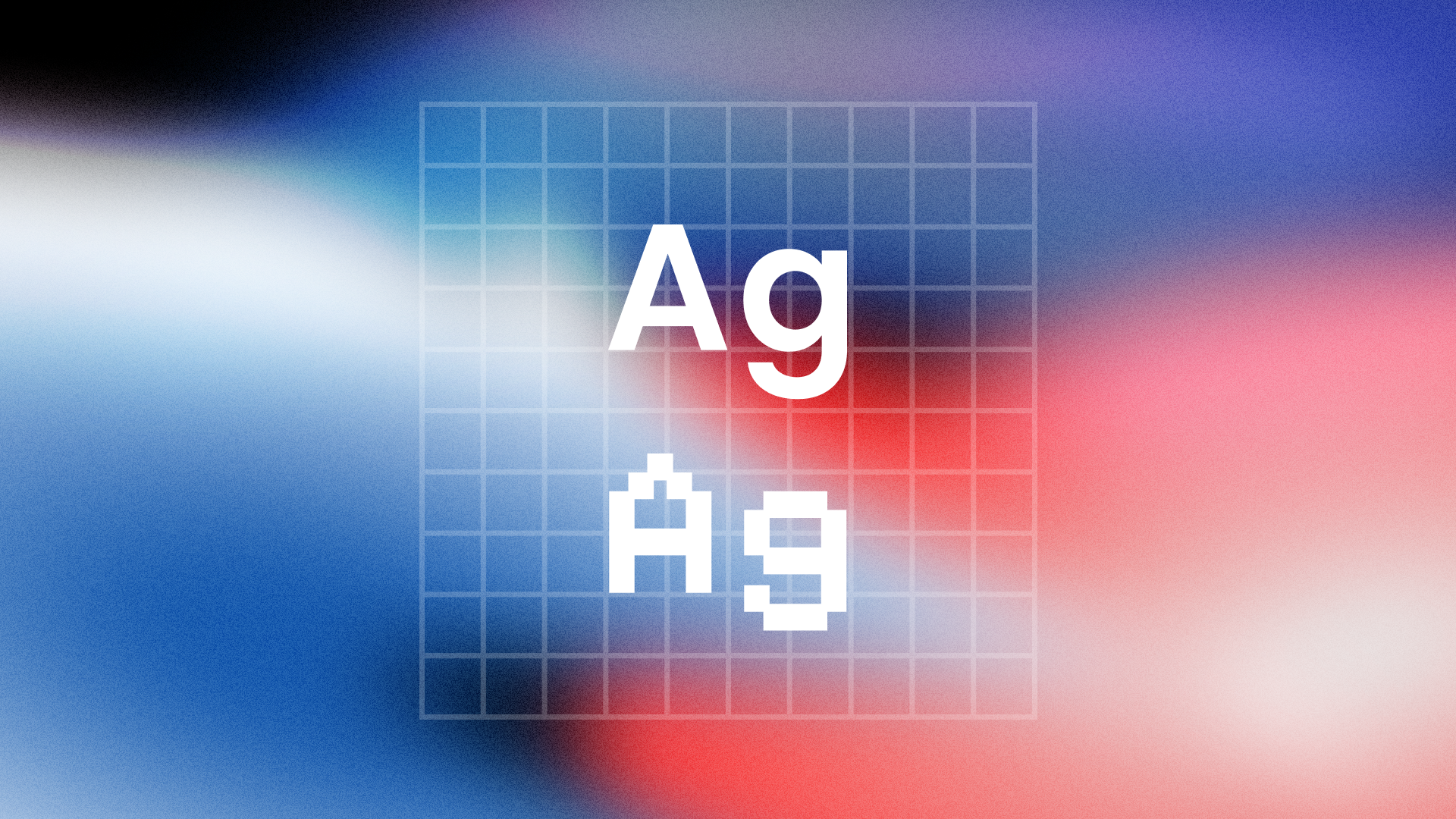
Typography isn’t just about choosing beautiful fonts — it’s about making them feel right wherever your users encounter them. On the web, that’s a complex challenge. The same text can look slick and elegant on macOS, but heavy and awkward on Windows. It might render crisply in Chrome, yet lose all finesse in Firefox. As designers and developers, we don’t just pick fonts — we have to manage how they're rendered across browsers, operating systems, and devices.
This article is a deep dive into how web fonts are rendered, why inconsistencies exist, and what you can do to ensure your typography looks great everywhere.
The Complex World of Font Rendering
Let’s start with a harsh truth: there’s no such thing as perfectly consistent font rendering on the web. Every platform uses different font rendering techniques. Windows leans heavily on ClearType, which often results in chunkier, more contrast-heavy characters. macOS uses subpixel anti-aliasing and gamma correction, producing lighter, smoother text. Mobile devices add another layer of complexity, with some Android versions skipping subpixel rendering entirely to save battery life or boost performance.
Then there are browsers. Chrome, Safari, and Edge are all based on Blink/WebKit, but each can interpret CSS font rendering slightly differently. Firefox, which uses the Gecko engine, often renders fonts slightly darker and with less smoothing. These discrepancies aren’t bugs — they’re the byproducts of each platform’s effort to optimize legibility in its own way.
Understanding this diversity is step one. Step two is learning how to work with it.
Choosing and Loading Web Fonts Thoughtfully
Web fonts give you branding power and design freedom. But poorly implemented fonts can lead to blurry characters, layout shifts, or performance issues. The first thing to get right is how you load them.
Today’s best practice is to use the WOFF2 format wherever possible. It’s compact, efficient, and supported in all modern browsers. You’ll often include a WOFF fallback too, just in case. Legacy formats like TTF or EOT are largely obsolete unless you’re supporting ancient browsers.
When loading fonts via @font-face, always include the font-display property. Setting it to swap allows your content to appear immediately with a fallback font while the custom font loads in the background. It’s the best balance between performance and perceived visual quality.
@font-face
{font-family: 'MyFont';
src: url('MyFont.woff2')
format('woff2');
font-display: swap;}
And don’t forget to subset your fonts. Most font files contain hundreds — sometimes thousands — of unused characters. Tools like Font Squirrel, Google Fonts subsetter, or Glyphhanger can trim your font files dramatically by keeping only the glyphs you need.
Font Smoothing, Anti-Aliasing, and Rendering Hints
Once your font is loaded, how it’s drawn to the screen becomes the next hurdle. This is where anti-aliasing and font smoothing come into play.
Anti-aliasing is the process of softening the jagged edges of text to make it look smooth on screen. Subpixel rendering — a more advanced form — uses the red, green, and blue components of each pixel independently to further refine curves and diagonals.
Different operating systems and browsers apply different smoothing by default, and these differences can have a significant visual impact. For example, macOS tends to render text lighter and smoother, sometimes to the point of it looking too thin. Windows, especially on non-HiDPI screens, can make the same font appear bolder and more aliased.
As a developer or designer, you can’t fully control these underlying behaviors — but you can influence them with CSS.
body {
-webkit-font-smoothing: antialiased;
-moz-osx-font-smoothing: grayscale;
 text-rendering: optimizeLegibility;
}
The -webkit-font-smoothing: antialiased property forces Chrome and Safari to use grayscale anti-aliasing, which can make text appear lighter and cleaner. On Firefox, -moz-osx-font-smoothing: grayscale does a similar job. text-rendering: optimizeLegibility enables kerning and ligatures in supported browsers, improving the readability of longer text blocks.
These tweaks are subtle, and their effects vary. Sometimes, they can make text look too light — especially on lower-resolution displays. So always test these settings on multiple platforms, including older Windows machines and low-end Android phones, to find the right balance.
Font Weights, Styles, and Fallbacks
A common issue in web typography arises when designers specify weights that aren’t actually included in the font file. For example, setting font-weight: 300 on a font that only supports 400 and 700 will force the browser to simulate the lighter style, often resulting in fuzzy or inconsistent rendering. That simulation rarely matches the crispness of a true designed weight.
The same goes for italics. Always verify the available styles in your font files and only use what the font truly supports. Tools like FontDrop can help you inspect font internals and check for weight support.
Fallbacks are another critical piece. You should always have a font stack that gracefully degrades when your custom font fails to load. More importantly, your fallback fonts should be visually similar to your primary font — in weight, width, and x-height — to avoid jarring layout shifts or style mismatches.
A thoughtful font stack might look like this:
font-family: 'Inter', 'Segoe UI', Roboto, Helvetica, Arial, sans-serif;Type Sizes, Spacing, and Visual Balance
Even with perfect font files and rendering settings, small type sizes are prone to degradation. On lower-density screens, text under 14px can become blurry or appear uneven due to pixel rounding and aliasing artifacts. That’s why many modern websites use a baseline size of 16px for body text — it’s readable, renders well, and gives you enough typographic structure for responsive scaling.
Use rem units instead of pixels where possible. They allow your typography to scale fluidly with user settings and make it easier to create responsive type systems. You should also control line-height explicitly, rather than relying on browser defaults. Letter spacing, too, should be adjusted carefully — especially when working with uppercase text, where spacing flaws are more noticeable.
Real-World Testing: The Only Way to Be Sure
No matter how carefully you build your typography, you won’t know how it performs until you see it in action. Tools like BrowserStack or LambdaTest can simulate different browsers and operating systems, but nothing beats testing on real devices. Always preview your typography on macOS and Windows, on both Retina and standard-resolution screens, and on mobile devices with different rendering engines.
Pay close attention to:
- Weight contrast and smoothness on Windows ClearType
- Color fringing or thinness on macOS subpixel rendering
- Fallback transitions during slow font loading
- Layout shifts caused by fallback fonts vs. custom fonts
Even minor tweaks — like switching to a different smoothing method or using a different weight — can make all the difference.
Final Thoughts: Rendering is Part of Design
Perfect font rendering doesn’t happen by accident. It’s a mix of performance optimization, visual design, and a deep understanding of browser behavior. While you can’t control how every system displays your text, you can reduce inconsistency and improve readability across the board.
Typography on the web is more than font selection — it’s font execution. And when executed well, it turns good design into great experience.


