Why a Component Leaderboard?
Every design team has their shared Figma component library — the heart of a design system.
But if you’ve worked in one, you’ve probably seen this:
- Components get added or updated by different people.
- You know some teammates are doing a ton of work, but there’s no visibility.
- Contributions are invisible unless you’re digging through version history.
That’s where the idea for a Component Library Leaderboard came from — a fun way to show who’s contributing the most, encourage healthy competition, and celebrate contributions.
Just a late-night brain dump into my iPhone notes while I was in bed.
A list of designer avatars, names, points, maybe a gold/silver/bronze tier for the top three contributors
In the morning i quickly sketched a rough drawing as i didnt have any computing access while i was looking after my son.
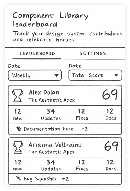
Rough and messy — just enough to capture the idea down.
From Sketch to UX Mock
Once the idea was on paper, I moved into a low-fidelity wireframes.
It was important to have a clear goal with feature details so i wouldnt end up with a vibe coded mess that was not funcational. At this point i didnt want to fret too much about styling either.
Goals at this stage:
- Establish layout: where the leaderboard sits, how rows are structured.
- Keep it grayscale — no distractions from colour or visual style.
- Make sure key elements (name, points, rank) are clear at a glance.
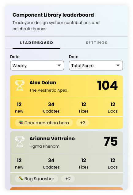
The UX mock is where I tried different card variations and layouts in Figma. I had alot of info i wanted to display it was important to experiment before i applied the UI.
The wireframe included:
- A header detailed the function
- Leader rows with avatar, name, and points.
- Filters to sort by “All time” or “This week”.
- Cards designs with alt layouts for data.
- Settings page to allow team shifting the scoring system to suit your needs
Designing the scoring system
Base Score Calculation: The core score is calculated from your actual Figma component contributions:
- New Components: +2 point per component created
- Component Sets: +2 point per component set (variants/multi-state components)
- Documentation: +1 point per component with written description
- Bug Fixes: Currently tracked at +1
Formula: Base Score = Total Components + Component Sets + Documented Components
Achievement Bonus System
Additional points are awarded through achievements that recognize quality contributions and would display as a badge on the users card:
📚 Documentation Hero - 50% of components documented+3
🎨 Component Master - 10 total components+5
🏗️ System Architect - 5 component sets created+4
✨ Consistency Champion - 100% documentation rate+2
🚀 Prolific Creator - 20 total components+6
Final Score
Total Score = Base Score + Achievement Bonuses
Why This Approach?
This scoring system encourages:
- Quality over quantity - documentation and proper component structure matter
- System thinking - creating reusable component sets gets rewarded
- Team collaboration - well-documented components help the whole team
- Sustainable practices - consistency and organization are valued
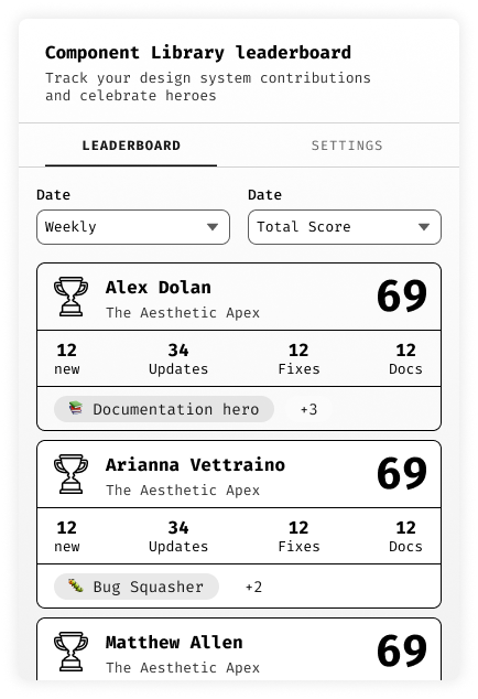
Applying the UI Layer
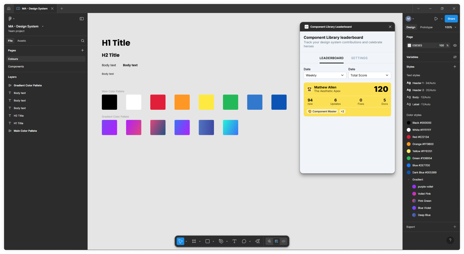
With structure locked in, it was time to bring in high-fidelity UI.
I wanted a clean style to the app, i used components from my own Figma/Rreact based design system i had previously created to speed things up. The UI could certainly be improved upon but i was very eager to dive into development and try complete this project in 24 hours.
Design principle: the UI should make the leaderboard fun, but not distract from working in Figma itself.
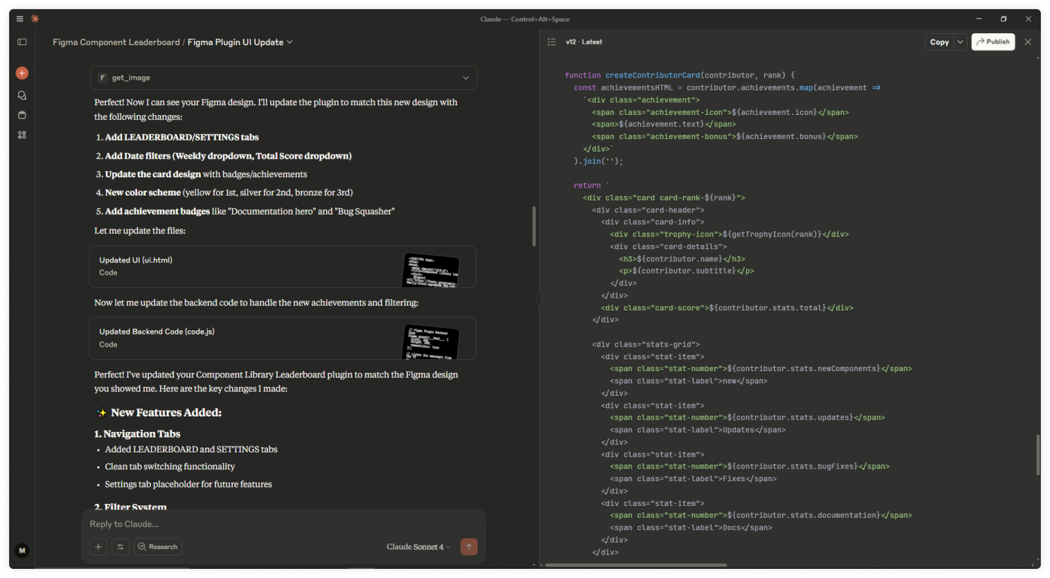
Bridging Design & Dev with MCP Server in Claude
Here’s where things got exciting.
To turn the UI into a working plugin, I used Claude’s MCP (Model Context Protocol) server integration.
If you haven’t heard of MCP:
- It lets Claude interact directly with your dev environment.
- You can give it real context — your code, manifest files, design tokens.
- It can scaffold, edit, and debug code with awareness of your project.
My process:
- Set up the Figma plugin scaffold (manifest.json, UI.html, code.ts).
- Connect Figma's MCP to Claude desktop app
- Request Claude begin to create components that match the design in Figma
- Request Claude help design js structure (i found its good at complicated things and bad at simple things)
It took a few attempts for Claude to recognise i had Figma’s MCP server turned on, i found being in dev mode with the frame selected worked best.
Test frequently with Figma’s plugin development mode.
Jumping into Figma you can import your manifest.json file and see a live preview of your plugin.
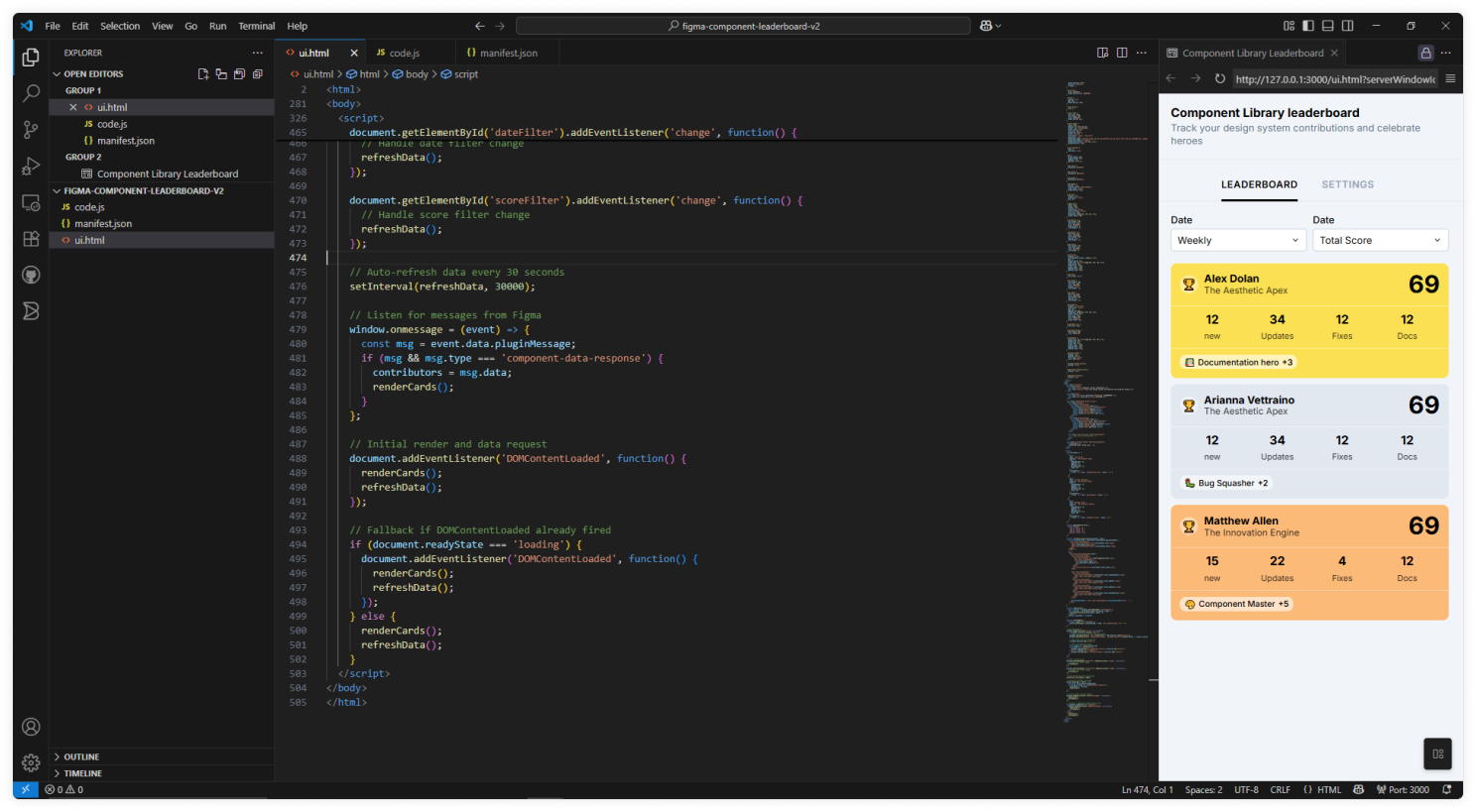
This workflow meant design and development stayed in sync — no endless token mismatches or manual style tweaks. Just saving your file from VScode live updates your Figma plugin if you have hot-reload plugin turned on in Figma.
I had a few problems with JavaScript Event Handling though this is where Claude AI was able to add detailed debugging which could then be shown in the Figma plugin console helping to better understand the problem and find a working solution.
- Tab switching logic: Managing multiple content areas with proper class toggling
- Message passing: window.onmessage for Figma plugin communication
- State management: Keeping contributor data in sync between UI and backend
- Event delegation: Handling clicks on dynamically generated content
Moving from dummy data to real data
Getting data on yourself as a user is fairly easy from Figma's API but getting data on other users in the same component library making contributions is alot more complicated. Figma's API has major constraints that limit what can be tracked. Heres the info i could get using the API.
Current User Detection
const currentUser = figma.currentUser;
// Returns: { id: "123", name: "Sarah Chen", photoUrl: "..." }
Component Access
// Can access all components in the file
const components = figma.root.findAll(node =>
node.type === 'COMPONENT' || node.type === 'COMPONENT_SET
);
Basic Component Data
component.name          // "Button/Primary"
component.description   // "Main CTA button for forms"
component.type          // "COMPONENT" or "COMPONENT_SET"
component.children      // Variants in a component set
The solution i found best was adding a parsing function to scan component descriptions for an author name, everyother solution would require some bad naming component naming conventions.
- Non-invasive: Doesn't break existing naming conventions
- Documentation-friendly: Encourages better component docs
- Flexible formats: Teams can use their preferred attribution style
- Retroactive: Can be added to existing components
- Rich metadata: Can track more than just creator (updater, status, etc.)
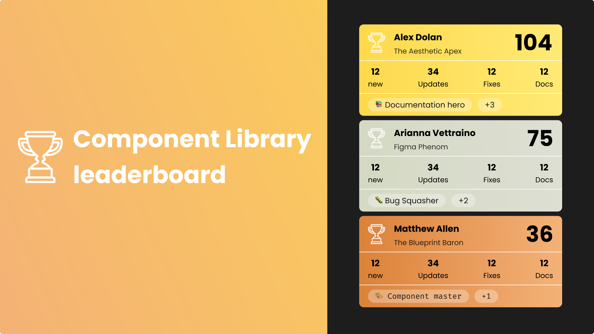
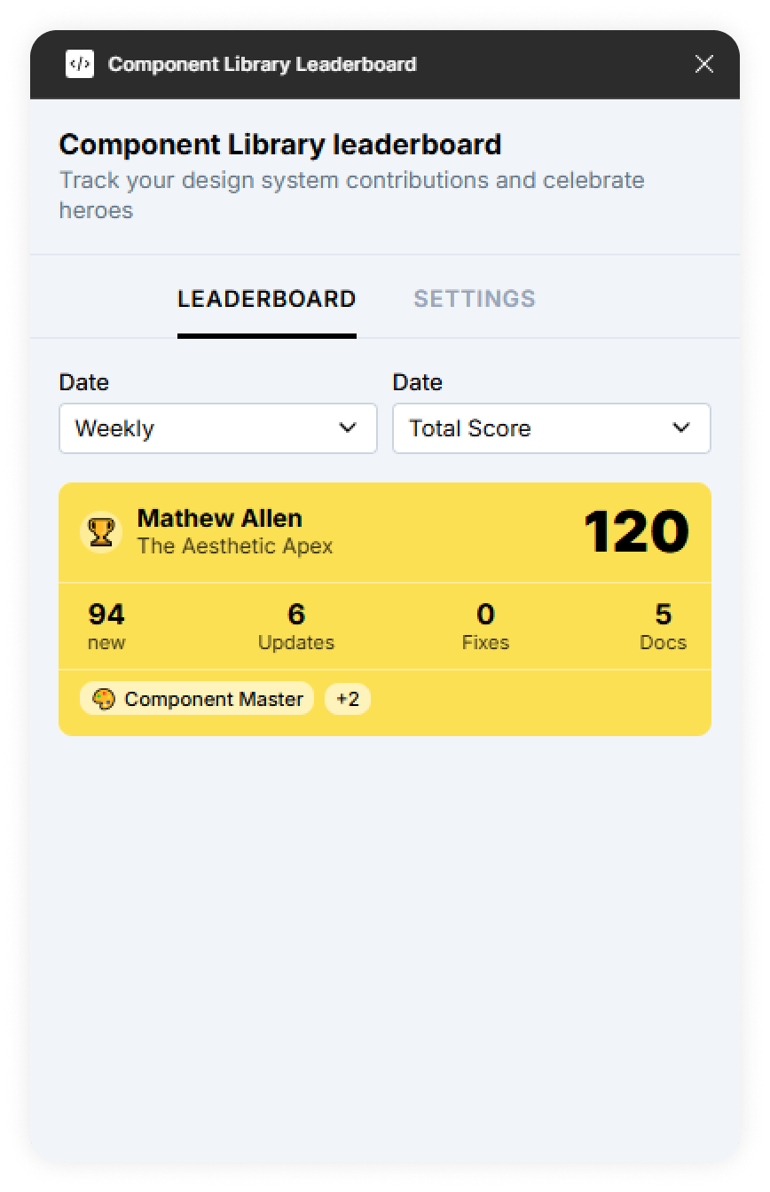
The Final Plugin in Action
after all that, I’m really happy it works.
Inside Figma, it’s fully live and production-ready:
- Live component usage stats pulled directly from your library.
- Weekly and all-time leaderboards for different time perspectives.
- Achievement-style ranking with gold/silver/bronze tiers.
- Ranking: Orders contributors automatically based on their component activity.
- Filters: Switch between “All Time” and “This Week” instantly.
- Motivation & fun: Every update to the library reflects instantly, encouraging healthy competition and rewarding active contributors.
The moment it loaded with real data from our component library, the leaderboard felt alive — no guessing, no placeholders, just immediate feedback for the team.
This was the live working version reading my personal component library.
Lessons Learned
This project reinforced a few truths:
- Read all the Figma API documentation thoroughly. Understanding the API saves your LLM time by enabling better, more precise prompt directions.
- Design it properly in Figma. Avoid just “vibe coding” or settling for the same AI-generated UI everyone else gets — invest in thoughtful design to create a unique, polished experience then utilizes Figma's MCP abilities to get your design pixel perfect in code.
- Bridge design and code early. Sharing tokens from the start saves refactoring headaches.
- Test in the real environment. Figma’s plugin API quirks show up early if you run your build often. (The saving grace being Figma's hot-reload dev plugin feature)
- Use AI where it fits. MCP with Claude didn’t replace my dev work — it accelerated it by keeping context in sync and helping to solve some complicated js issues.
What’s Next
- Sharing it with the team and gathering some feedback
- Team challenges — set contribution goals for sprints or product releases.
- Integration with project management tools — automatically log top contributors into sprint retros or recognition boards.
- Public showcase mode — display the leaderboard on a team dashboard or office screen.
- Prizes for end of month most points
- Figma community upload with a general theme soon to come
- Forget about it and move on to other ideas im currently making?
The goal is to keep it fun while strengthening collaboration and transparency in design system maintenance.
Writing this article took the same time as all the design and development work!
If you made it this far thank you very much for reading <3