In a world where users are constantly bombarded with digital experiences, it's often the smallest details that make the biggest difference. Microinteractions — those subtle, often-overlooked design moments — play a crucial role in shaping how we feel about an interface. They might not grab headlines, but they leave lasting impressions.
Whether it’s the satisfying vibration when pulling to refresh, the subtle tick of a toggle switch, or the reassuring nudge of a login animation, microinteractions quietly guide users, build emotional connections, and make digital products feel alive.
What Are Microinteractions?
Coined and popularized by designer Dan Saffer, microinteractions are small design elements that revolve around a single task. They typically have four components:
- Trigger: What initiates the interaction (e.g. clicking a button).
- Rules: What happens during the interaction.
- Feedback: Visual, audio, or haptic cues.
- Loops and Modes: How the interaction evolves over time.
While seemingly trivial, these interactions shape usability and brand perception. They're the difference between an app that feels mechanical and one that feels human.
Why Microinteractions Matter
They Provide Instant Feedback
When a user takes an action, microinteractions give a sense of response — confirming that something is happening. Consider Instagram’s heart animation when you like a post. It's quick, playful, and satisfying. You don’t just see a like counter go up — you feel it.
They Improve Usability
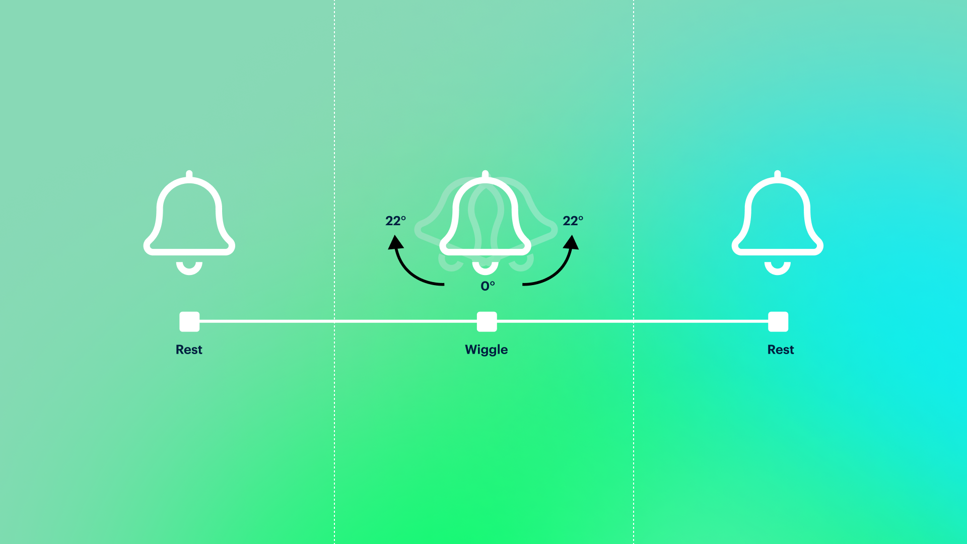
Microinteractions help users navigate complex interfaces with subtle clues. A loading spinner indicates waiting. A password field shaking when input is incorrect mimics real-world frustration — gently reminding the user to try again.
They Enhance Emotional Connection
Good microinteractions can surprise, delight, and form a bond. Slack’s loading messages (“Please hold while we summon your workspace…”) inject personality into a moment that’s otherwise just waiting.
They Reflect Brand Personality
Every interaction is a brand touchpoint. Apple’s attention to microinteractions — from the bounce of iOS icons to the elastic scroll — makes its software feel consistent with its broader brand: polished, thoughtful, and user-centric.
Notable Examples of Microinteractions in the Wild
- Facebook’s Reaction Emojis
- The long-press on the like button to reveal expressive reactions wasn’t just functional — it was emotional. It gave users a more nuanced way to communicate, wrapped in delightful animation.
- Google’s Material Design Ripple Effect
- Tap anywhere on a Material Design button and a gentle ripple radiates outward. It's subtle, but it makes digital interaction feel physical — like touching water.
- Twitter’s Refresh Animation
- When pulling down to refresh the timeline, Twitter’s animation transforms and stretches — a light, playful cue that you’re about to see new content.
- Airbnb’s Favourite Heart Animation
- Instead of just changing color, clicking the heart icon in Airbnb triggers a burst — turning a mechanical action into a joyful moment. It’s emotional, and reinforces the sense that you're saving something meaningful.
Microinteractions Done Right
What separates great microinteractions from gimmicks is purpose. The goal is not to decorate, but to communicate. A good microinteraction is:
- Contextual: It appears only when needed, and feels natural to the task.
- Subtle: It doesn’t distract or overwhelm. It complements the experience.
- Efficient: It improves clarity and speed, rather than adding friction.
- Consistent: It aligns with the product’s visual and interaction language.
Designing Your Own
When designing microinteractions, ask yourself:
- What moments in my product feel too mechanical?
- Where do users need subtle feedback or encouragement?
- What tone or personality should this product convey?
Start with key flows — onboarding, error states, confirmation messages — and build from there. Test in real contexts. Observe how users respond. Refine relentlessly.
The Takeaway
In the noisy landscape of product design, microinteractions are a whisper — but a powerful one. They speak directly to the user’s instincts, emotions, and expectations. Done right, they fade into the background — yet their absence is always felt.
So the next time you're polishing a design, remember: the magic often lives in the moments in between. That soft toggle click, that playful heart burst, that gentle ripple under your finger — they are more than animations. They are the soul of the experience.